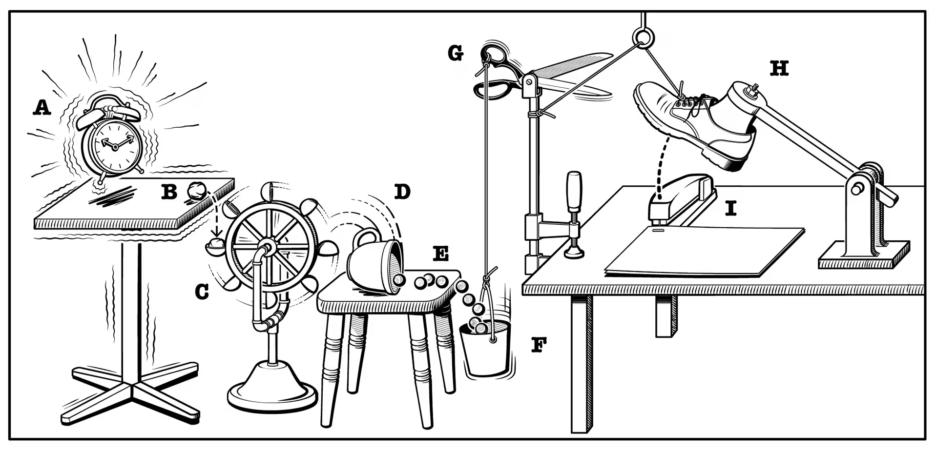
Frontend complexity and the HTML renaissance
HTML currently leaves a lot to be desired. Form validation still looks terrible in some browsers and can’t be styled. There’s no combo-box. The UX of <select multiple> is abysmal on certain platforms. The date input can’t select a range between a start and end date. There’s a <menu> element but its indistinguishable from a <ul> and includes no menu-like behaviour whatsoever. I could go on. Building these sort of components with the correct focus management, keyboard navigation and accessibility is a tricky task. Understandably, open source component libraries have become wildly popular…
The hardest task in computer science: rendering a button?
It feels like frontend development has become both simpler and more complex at the same time. JavaScript has swallowed the whole of frontend development, yet the newfound power of HTML and CSS has made JS entirely unnecessary for a great many tasks (lazy loading images, masonry layout, anchor positioning, scroll-driven animation…) Developers are approaching rendering simple UI components as if they were tackling a hardcore software engineering problem with the building blocks of the web increasingly abstracted into a Rube Goldberg machine.
We all understand the power of components. JavaScript-based UI component libraries can abstract away intricate markup and JavaScript, but they also introduce their own complexity, often obscuring the simplicity of HTML. Here’s the directory for the accordion component in one open source library:
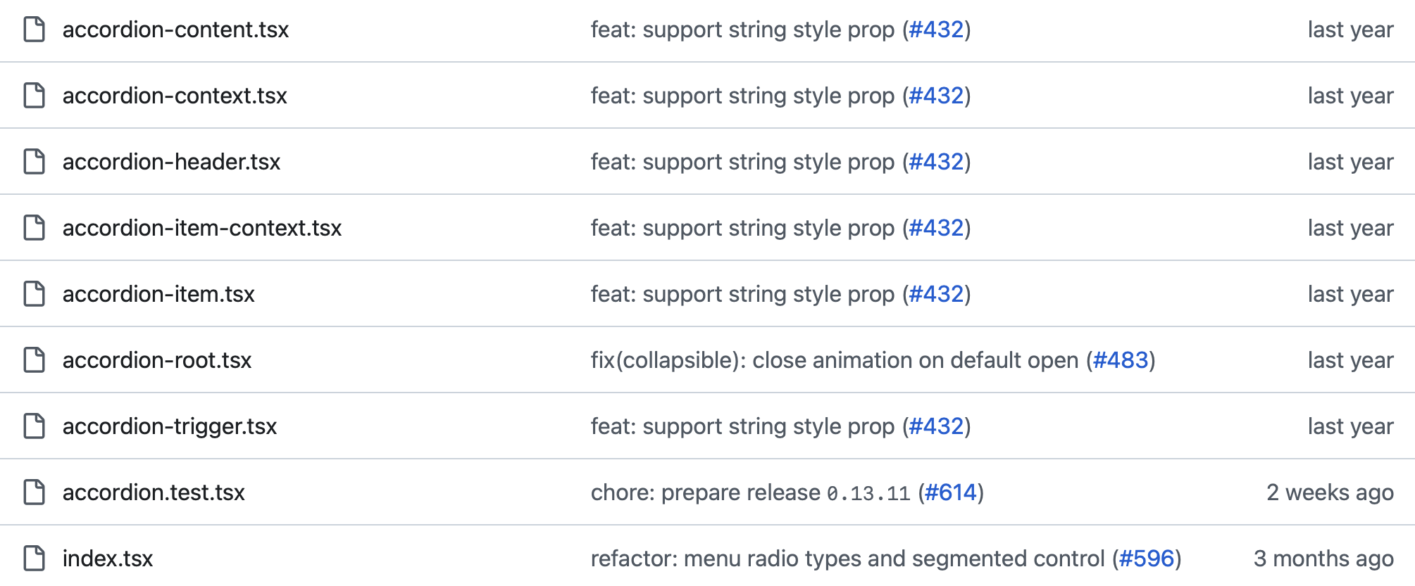
While, as the consumer of this code, you don’t need to read or maintain it, it does speak to the complexity of modern frontend. By contrast, here’s an accordion built with raw HTML:
<details name="faq">
	<summary>Is this accordion built with the HTML details and summary elements?</summary>
	Yes.
</details>

<details name="faq">
	<summary>Does find-in-page search automatically open the relevant section?</summary>
	Yes. Try searching for this text when this section is closed.
</details>

<details class="accordion-details" name="faq">
    <summary class="accordion-summary">Lorem ipsum?</summary>
    Lorem ipsum.
</details>
There’s now more functionality built into a zero-JS HTML-only accordion than you get from the majority of popular JavaScript framework-based accordions. When ‘find in page’ is used to search for text within a <details> element, the relevant section will automatically open. You do not need to manually add hidden="until-found" as that behaviour is the default. The same applies to URL text fragments.
Is this accordion built with the HTML details and summary elements?
Yes.Does the relevant section open when find-in-page search is used?
Yes. Try searching for this text when this section is closed.Lorem ipsum?
Lorem ipsum.You’re free to style the accordion however you want:
As of Chrome 131 you have more options to style `<details>` and `<summary>`.
— Bramus (@bramus) November 20, 2024
You can now use of the `display` property on these elements, and also use a `::details-content` pseudo-element to style the part that expands and collapses.https://t.co/PCTwbUpOxB pic.twitter.com/WpmmDhgIhu
Design system consultant Brad Frost has written of the wasted labour as developers reinvent the wheel:
“Right now, vast numbers of human beings are devoting their time and energy to designing, building, documenting, and maintaining the exact same set of common components… By and large, these components are unexceptional commodities that assume the same general shape and behavior.”
Energy is being expended to deliver what should always have been part of HTML.
“Is there a Solid ShadCN port yet?” asked one potential Solid JS user, as if a nicely styled checkbox were the primary criteria for choosing a JavaScript framework. Rich Harris and Ryan Carniato, creators of Svelte and Solid, have spoken of a roadblock to mass adoption: the lack of UI component libraries for their respective frameworks. The gargantuan ecosystem around React — including its ready-made component kits — is part of the reason newer frameworks have trouble gaining traction. What often amounts to some nicely-styled reinvented HTML is all too often deeply tied to a specific niche in the sprawling JavaScript ecosystem. In the longer term, this shackles teams to legacy tech and creates open-source vendor lock-in.
In open source, to take React component libraries alone, there’s Shadcn, React Aria, Ariakit, Radix, Base UI, MUI, Chakra, Ant, Mantine, Origin UI, Hero UI, Semantic UI, Catalyst… those are just a few that come to mind. Most large companies build their own unique custom component library from scratch, often spending hundreds of thousands of dollars in the process. While some of these components fill genuine gaps in HTML, the bulk of these projects are reinventions of elements the browser already provides (checkbox, dialog, radio, range, etc) but with different styling. Hundreds of different, yet functionally and visually almost identical components are being designed, built and maintained. Components that look much the same but have different markup, different props, different styling APIs… Each one has a huge docs site. When I look at the documentation for one of these projects, I feel like I’m learning an equivalent of HTML all over again. What if the documentation for a component was MDN? What if you didn’t need to look at documentation if you already knew how HTML worked?
Even the most popular open source projects go into maintenance mode, get deprecated or go completely unmaintained. You can spend time learning and utilising a UI library only for it to become obsolete. To take one example: Radix, perhaps the most popular component library in the React ecosystem, has been largely superseded by Base UI.
cool to see so many of you recommending @base_ui in this thread. fwiw, i agree that radix is a liability. off all of the headless ui libs, it's the last option i'd consider for any serious project. https://t.co/lykIW9nRLe
— Colm Tuite (@colmtuite) June 19, 2025
Installing a dependency is easy but you’re then responsible for updating it in perpetuity. Radix has had 1691 GitHub issues raised over the course of its life. The annoyances of NPM-driven development are by now overtly apparent: the neverending security warnings, breaking changes between versions… That may be worthwhile for a framework or router but its questionable whether that management burden is worthwhile when what your installing is a glorified div.
Abstracting away HTML has meant there’s a whole generation of developers where basic knowledge of the most fundamental language of the web is often lacking. All because the default HTML elements are slightly too ugly and difficult to customise with CSS. HTML is mostly idiot-proof for anybody that can be bothered to learn it. The same can’t always be said for the miscellaneous dependencies and over-engineered abstractions that have defined the last decade.
“Each layer of abstraction moves you further from the platform, ties you further into framework lock-in, and moves you further from fast.” - Harry Roberts
The HTML (and CSS) renaissance
In 2022 Mozilla published their “vision for the evolution of the Web”:
While Web experiences have become substantially more rich over the past 20 years, the expressiveness of HTML and CSS has not kept pace… the limited HTML/CSS feature set means that authors feel compelled to use larger and increasingly more complex JS libraries & frameworks for nearly any interactive site. In a better world, it would be possible to build more of these experiences using only the capabilities built into the browser.
There are two deficiencies here that are worth addressing. The first is the lack of good standardized controls that are also easily styleable across browsers. Native app platforms such as iOS and Android provide rich libraries of controls which perform well and are styled to match the rest of the platform. By contrast, the base Web platform is comparatively deficient, with a much more limited set of built-in controls. And where the web does have equivalent controls, they’re often insufficiently styleable… which makes it difficult to make them visually consistent with the rest of the Web page. We want to fill these gaps.”
The first article about the new <select> element was published by CSS Tricks in March 2022 and its still not in all browsers. The dialog element was implemented in Chrome in 2014 but didn’t reach all browsers until 2022. Progress is slow, but it is happening. Patrick Brosset, a Product Manager on the Edge team at Microsoft, concluded the 2024 State of HTML survey results with the following:
With the increasing number of capabilities we’re getting, building performant, accessible, and interactive HTML-first UIs is becoming easier all the time, making it possible to reduce JavaScript usage to where it truly matters, and letting web servers and browsers communicate how they were meant to: with HTML!
After years of inertia since HTML5, HTML is starting to deliver the base components and functionality developers need. Let’s take a brief look at what’s new and forthcoming.
Color picker
The best third-party color picker is probably the one in React Aria from Adobe. Arguably, the UX of the browser-native color picker on iOS is superior to what can be achieved with React Aria.
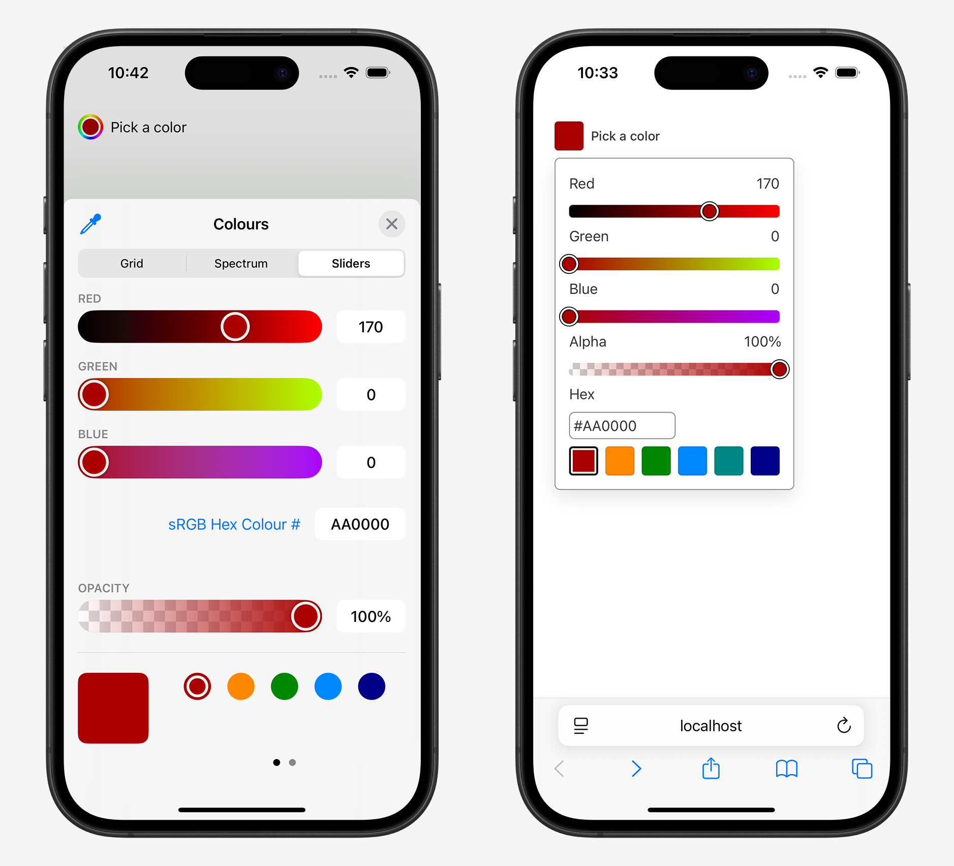
While I could have styled the React Aria component in all sorts of different ways, building the functionality of the native iOS picker wouldn’t be possible — the native bottom sheet slides over and covers the URL bar, a behaviour that can’t be achieved via JavaScript.
React Aria does offer more customization than the built-in browser picker. Building Photoshop for the web? If so, you probably need that level of control. If not, then you almost certainly don’t. Both optionally allow users to select an opacity value. In HTML, this is achieved via the alpha attribute. Both offer the ability to provide color presets for the user to choose from. In HTML this is achieved via a datalist, which is supported in all browsers.
<input alpha list="colors" type="color" value="#AA0000">

<datalist id="colors">
  <option value="#AA0000"></option>
  <option value="#FF8800"></option>
  <option value="#008800"></option>
  <option value="#0088FF"></option>
  <option value="#000088"></option>
</datalist>
Select
You can now use <hr> to visually demarcate different options of a <select> element.
The long-running endeavour to make the <select> element customizable is finally coming to fruition (currently supported in Chrome/Edge).
Checkbox and Switch
The native HTML checkbox and radio controls don’t look too bad, but they’re far too small in Safari. As of Safari 26, all browsers support the CSS width and height properties to set the size of these native form controls (previous versions of Safari maxed-out at a size of 16px). Together with accent-color, that does offer a fair amount of customization:
For some designers, that isn’t enough control. If you want a custom border-color, border-radius or custom tick icon, that’s only possible by hiding the default widget with appearance: none. The forthcoming appearance: base will offer a better solution, rendering the element in a way that is consistent across all browsers while being fully stylable via CSS.
In Safari, a toggle switch can be rendered without a single line of custom CSS. It’s just <input switch type="checkbox">. In other browsers it’ll currently render as a checkbox.
Dialog
The dialog element has been supported in all browsers for several years. There’s now an optional light-dismiss functionality built in (i.e. a way to close the dialog when the user clicks outside of the dialog). The command and commandfor attributes mean that opening and closing dialogs and popovers is easy to implement without JavaScript.
File input
All browsers support ::file-selector-button to style the button inside a file input.
Text inputs and textarea
Setting the CSS field-sizing property to content will cause an input, textarea or select element to automatically grow to fit the size of its content.
Form validation
The :user-valid and :user-invalid pseudo-classes are equivalent to :valid and :invalid but with a key difference: they only apply after the user has interacted with the form control either by changing its value or attempting to submit the form.
And all HTML elements support both light and dark mode by default — with zero custom CSS.
The Path Forward
While these improvements might not sound revolutionary in isolation, taken as a whole, they beckon a future where third-party JavaScript components are less necessary. The CSS Forms spec will eventually bring simple customization to all form controls, fundamentally changing how design systems are built. The Chrome team have been pushing for CSS-only carousels and are looking into multi-select. There’s ongoing work to standardise tooltips. We might even get a menu element that’s actually useful, and even if we don’t, between popover, focusgroup and anchor positioning, it’ll be fairly trivial to build your own. The Open UI group is working on standardisation for all sorts of useful things. Some third-party components will remain helpful but a simpler version of frontend development is possible.
Ryan Florence, co-creator of React Router, recently tweeted:
Once I built a little video site for my tutorials and after you visited a video the link to it turned black (from red). One of the Ember core team members was like “How did you do that? There’s no local storage or anything what is going on?!” I used
a:visited. Sometimes we get so caught up in complexity we forget there are actually simple solutions to things. Things you forget about when you’re deep in the belly of framework abstractions. Then when you see them solve a problem you just assume it’s some wild magic, but it’s not.
It’s time that developers rediscovered the power of HTML and CSS.